watercolor

Softer but still me...

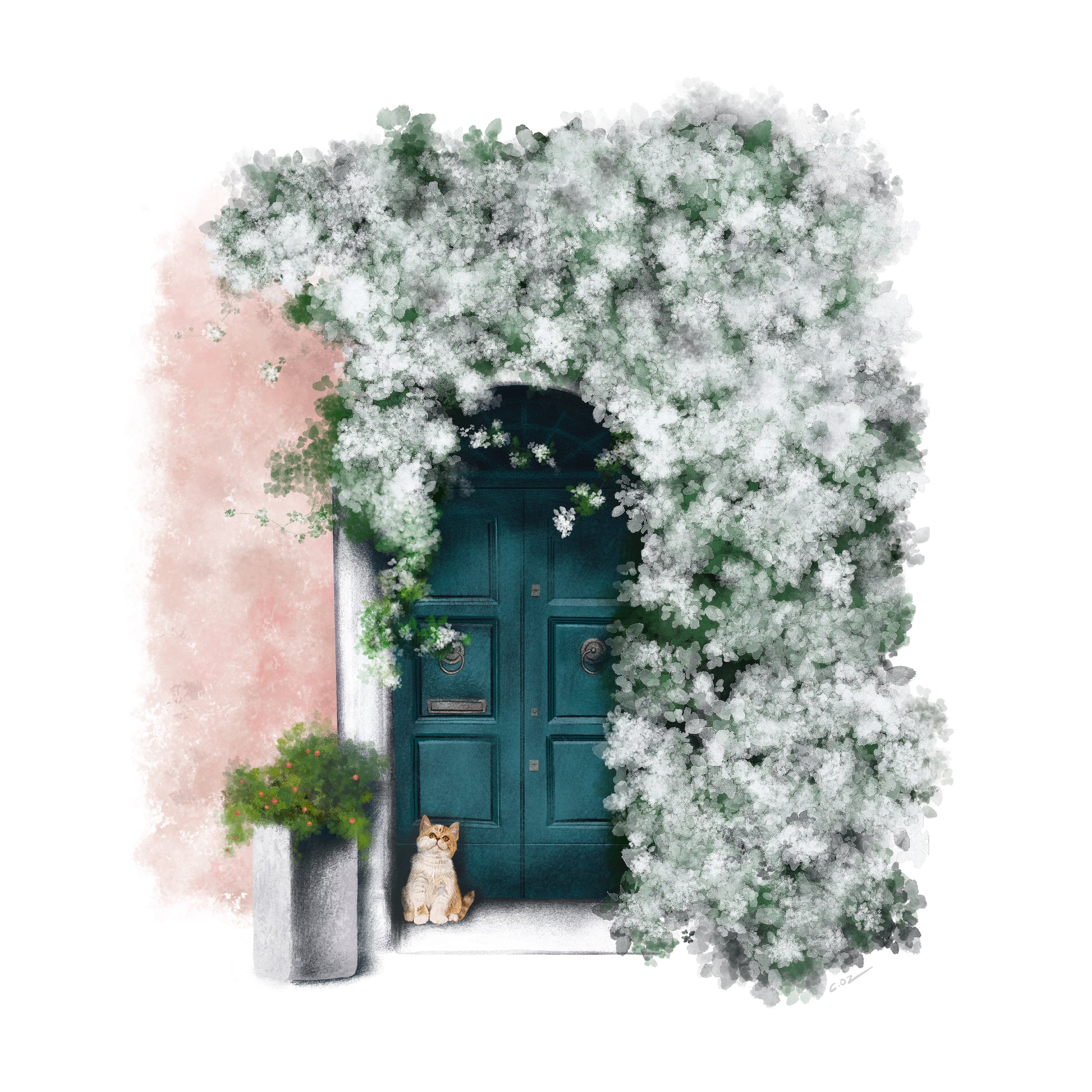
Last week I finished up working on a new digital illustration. It was inspired by some lovely photo reference by Harbor and Hill that I follow on Instagram. If you want to see some amazing travel photos, you should check out them out!

I recently purchased and downloaded some new watercolor and gouache brushes to use for my iPad. I just love the results! This illustration is a little softer in color and texture than my normal work.


Prints coming soon of this illustration! Maybe cards too….

Artwork by Michigan artist, Cheryl Oz

Artwork by Michigan artist, Cheryl Oz

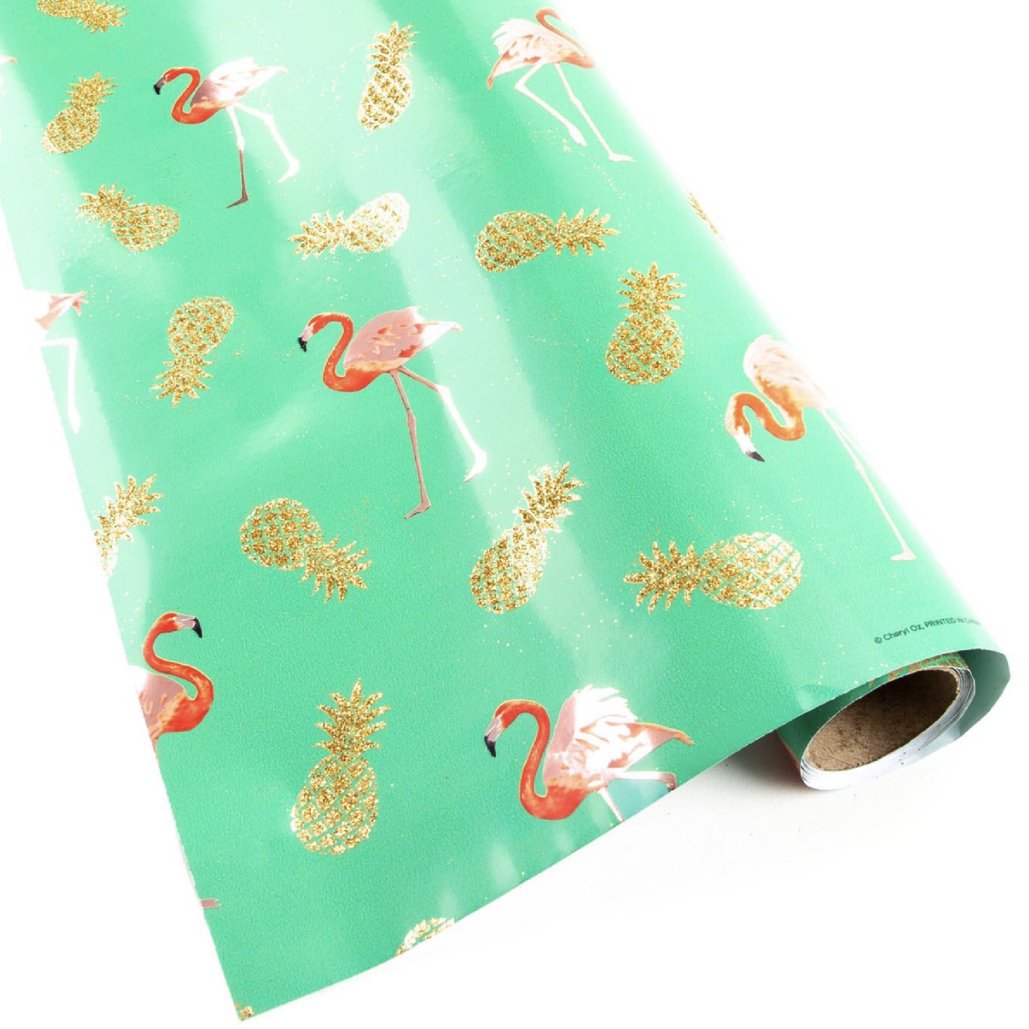
Flamingos : Client Project for Papyrus

Last January, I worked on some watercolor flamingos for Papyrus on a gift wrap project. The scope of the work was to have me create just a couple of full flamingo bird illustrations, and then some bird parts so that the Art Director could create multiple birds in different poses for the gift wrap. It was such a fun, colorful project to brighten up my workspace in the midst of winter here in Michigan! I can’t wait to see the gift wrap in person when my artist samples arrive.

in progress on my studio table…. (artwork by Michigan artist, Cheryl Oz)

in progress on my studio table…. (artwork by Michigan artist, Cheryl Oz)

Watercolor illustration by Michigan artist, Cheryl Oz

Watercolor illustration by Michigan artist, Cheryl Oz

Watercolor illustration by Michigan artist, Cheryl Oz

Watercolor illustration by Michigan artist, Cheryl Oz

Watercolor illustration by Michigan artist, Cheryl Oz

Watercolor illustration by Michigan artist, Cheryl Oz

Watercolor illustration by Michigan artist, Cheryl Oz

Watercolor illustration by Michigan artist, Cheryl Oz

“Pineapple Tropic Party Roll Wrap” — Photo compliments of Papyrus

“Pineapple Tropic Party Roll Wrap” — Photo compliments of Papyrus

“Pineapple Tropic Party Roll Wrap” — Photo compliments of Papyrus

“Pineapple Tropic Party Roll Wrap” — Photo compliments of Papyrus

Welcome to my new site!

HOORAY! I’m excited to finally launch my new portfolio website! When I finally decided to have my online portfolio, I knew I wanted the design to be simple, clean and lot of white space. I use a lot of white space in my work, so I wanted something that would make the vivid colors in my work, standout and sparkle. It was also important for me to have a site with easy navigation, and to be honest for me to quickly update with new artwork. I’ve had personal websites before, I used to design wedding stationery. I’ll tell you more about that another time. I’ll try to update new work as often as I create it, to keep the material fresh. I’ll also try to announce when I’m having something exciting happening in the studio, events, sales in my Etsy shop too, any other random creative thoughts I might have, and of course new recipes that I may love and like to share. I love to cook as much as I love creating art! I hope you love the site as much as I do, this little puppy is long over-due!

Thank you so much to my husband who puts up with all of my artist craziness! Coincidentally, I’m making my first blog post on our 16th anniversary. YAY! I can’t imagine what my life would have ever been without you. Thank you for all you do and your endless amount of support! I love our journey together. XO XO

Thank you to my friends and family, especially you Mom, (and if Dad were here I know he would be so proud too)!

Last but never least, thank you, thank you to all of the clients who have hired me to do work for them. My customers from brick and mortar shops, the shop owners (Theresa, Melissa, Holly, Nicole and Kat) who carry my work and their employees (Janine!) that work so hard to sell my work, my customers at art fairs and my online Etsy customers too!

You’re all a part of making my artist dreams come true! THANK YOU!